
For the past several months, social media algorithms have sent me videos of contemporary art making. These videos show men and women convulsing randomly to create marks on a page or to change the shape of a so-called statue. Most people who react to these videos rightly criticize the emptiness of this artistic process. However, the failures of this extreme example of performance art can also be found in much of the other material we consider art.
When people hate post-modern performance art, they argue that it is empty or that “there is no depth.” When one makes statements like these, one argues that the function of art is contemplation. Whether there is substance to contemplate or not, people stand in front of paintings at museums, trying to deduce the message or truth behind a piece. This is the distinguishing characteristic between art and Live, Laugh, and Love decorations.

Heather Hansen’s Emptied Gestures via Beautiful Decay
A fair criticism of much of the common or contemporary Christian art is its lack of depth. Think of the airbrushed images of Jesus, or depictions of him holding a lamb. These images can have a lot of value on a personal level. Many people love the airbrushed Jesus because it is what they are familiar with and it is enough to provoke personal contemplation on some level. Others like the vague shepherd-Jesus images because they try to convey his pastoral nature. There is nothing wrong with a pleasant image like these, but that’s as much as they are going to be, pleasant. For a personal devotional, they do their job very well.
If you were to put a pleasant but vague Christian image in a room with post-modern performance art, no one would pay attention to the Christian image. While the Christian image is actually trying to say something and has a better message, the message is not provoking enough and the image itself isn’t gripping enough. The performance art doesn’t have a real message, but that doesn’t matter. It makes people feel like artists because it’s weird and resembles something one would see in a gallery in Portland. It makes others hate it because it resembles what someone would see on the streets of Portland. Either way is draws attention. Where one is better at delivering a message, the other is much better at being a spectacle that overshadows other better artwork.
To demonstrate these elements of design and how they produce art, imagine a chart where the y-axis is labeled spectacle and the x-axis is labeled contemplation. In other words, one axis is how much it draws our attention and the other is how much it is worth drawing our attention.
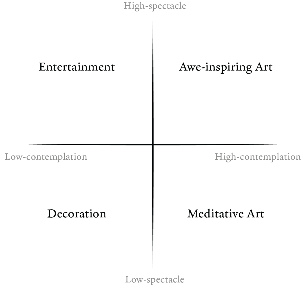
We can make from this chart quadrants. Low-spectacle and low-contemplation is decoration, the Live, Laugh, Love section. High Spectacle and low contemplation are purely entertainment. I would consider both quadrants on the right side art. High spectacle (meaning draws our attention), high contemplation is awe-inspiring art, and low spectacle, high contemplation art is meditative art.
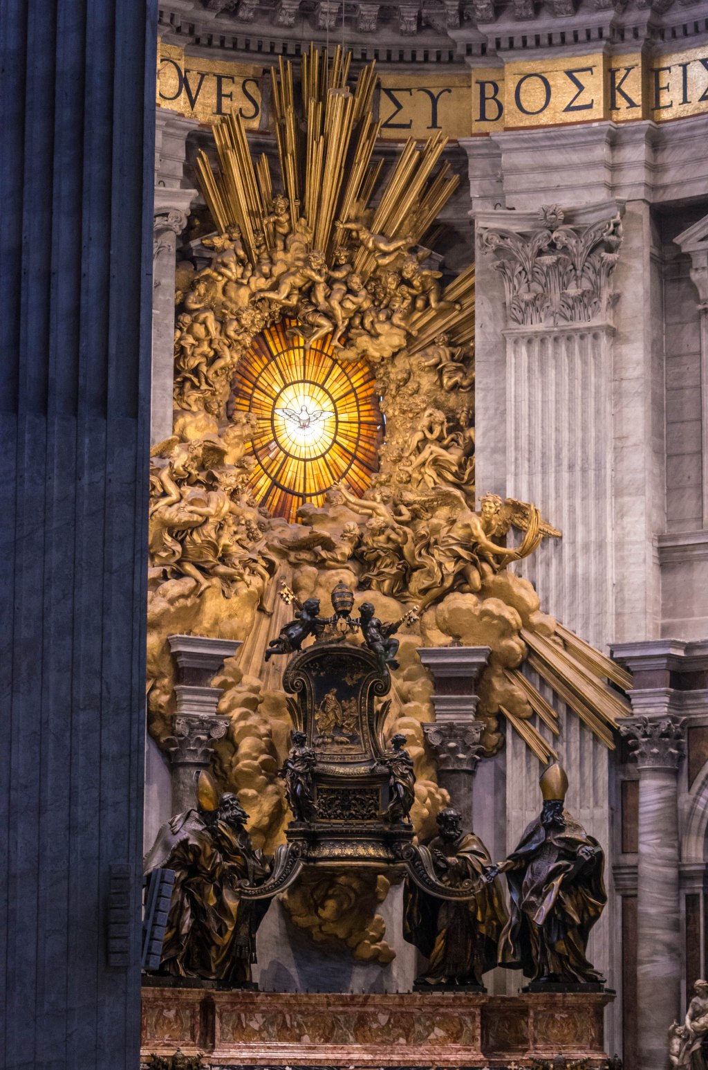
Spectacle as it relates to contemplative art (the right side of the graph) often varies in quality, but also in emphasis. For instance, an icon purposefully limits many of its visual elements. Whereas Renaissance and Baroque art found in many Italian churches pushes what is possible for visuals and composition. For the renaissance art, one is drawn into contemplation by the scope of the subject matter, the craftsmanship, and the size which all point to the theological messaging behind the piece. In icons, limited visual languages help the viewer pray with the piece, reflecting on supernatural realities through an abstract style. They are still beautiful pieces, but rely less on pushing their visuals than other forms of art. Further, we can find great Eastern churches completely adorned with icons. When implemented like this, the icons have a far greater awe-inspiring effect. Similarly, with Catholic art, not all of it has the spectacular nature of St. Peters Basilica, but is modest and meditative like an icon.

Andrei Rublev, Public domain, via Wikimedia Commons
Now back to the paradigm as a whole, we can see many weaknesses of different works of art by charting them on this graph. The aforementioned post-modern performance art ranks highly on spectacle, but has difficulty inspiring real contemplation. It lands in the entertainment category rather than as art. The issue with much of the airbrushed or “happy Jesus” type of art is that it would be placed low on both axes. Often they aren’t spectacular and don’t say a whole lot. There’s nothing wrong with using these pieces as devotional art or decorations, in fact, they might work well for someone, but they won’t create awe or provoke contemplation as well as others do. If the goal is entertainment, then get something more spectacular. If the goal is contemplation then other pieces will work better.
This is also true from a secular standpoint. Many pieces created today aren’t spectacular or thought-provoking. If you like them, they’re great decorations, but they aren’t art. Many of the movies we watch or even the AI-generated photos we see are spectacular. But they also don’t say much and are best for entertainment. Pieces that make you reflect on something true, like good poetry or a romantic landscape, hold a lot more value. Even though poetry and good landscapes are sometimes modest, they invoke real emotions that prompt real contemplation of beauty.

TEARING ON” / THE ‘WILD RANGER’ 1044 TONS BUILT IN 1853 by Montague Dawson via Wikimedia Commons
This isn’t the only or best way in which we can critique art but it’s helpful to start to think of distinctions between works of different quality. As a creator or a viewer, endeavor to create or meditate on art further on the contemplative side of the chart. Instead of saying “It’s all subjective”, think critically of art and ask “What’s the point?”, “Why should I care?” and “Is the message good, true, or beautiful?”

Leave a comment